Through the Eyes of the Sculptor
Sculptor, Emmanuel Fillion, had a love for stone from a young age. His love for stone developed into gaining skills to carve stone and then eventually full blown sculpting. I found it impressive that at just 15 years old, Emmaunuel received a scholarship to study stone carving and majored in the restoration of historical monuments. I honestly didn't even know that they had people who studied something that specific. I liked the part in the video where they showed the restoration of the bridge in Paris. The whole process was really fascinating and I can't imagine the patience and skill these carvers must have. Throughout the video, there is a lot of relation to the readings from the text. Emmanuel talks about the importance of aesthetics in the piece, the materials and stones used to create sculptures, and the importance of planning so that the piece will be strong. An idea is first visualized as a drawing and then made into a clay figure. The clay figure allows for the creative process to take place and changes to be made. From the clay sculpture, a silicone mold will be made by dividing the piece into parts. The mold takes all of the details of the clay and allows for the sculptor to pour the plaster into the mold to achieve the same model as the original clay piece. Plaster is a temporary stage between the clay and the marble. This video has definitely given me a deeper understanding of sculpting because I was able to watch the steps of creating a sculpture. It was also interesting to learn about the different types of stone, where they come from, and how they test the stone before they start to carve into it. I was also really interested in the way they transported the stone in Michelangelo's time. It was insane how they were moving those extremely heavy, very large blocks down into the shipyards with the men holding ropes and using logs to roll them down. It just looked so incredibly dangerous. It was amazing that they even had men in the video that actually had that job and lived through that time. I couldn't believe they even lived through it, especially since they had started such a dangerous job at just 12 years old.
Glass and Ceramics
This video was interesting because it actually showed how glass is made in extreme detail. The video is right, glass is everywhere, and it is just one of those things I never thought too much about as far as where it comes from. The beginning of the video was amazing when they showed the man molding the glass into like a glass dish. He was spinning it and molding it like crazy, swinging it all around and cutting into while it cooled until it took shape. The art of glassmaking is unreal. Ceramics were tied into the video well by the explanation of the quality of the finished product. It was interesting that a very pure clay fired at 1,400 degrees celsius produces fine China, while most ordinary clay is fired at 1,100 degrees celsius produces bricks or floor tiles. I always wondered what made fine China, "fine" and more expensive. This video tied in well with the readings from chapter 12. While the text explained the creation of glass and ceramic pieces, it was very helpful to have the visual that came with the video. The firing is what determines the final state of the finished product. The most important phase of production. Simple shaped objects like plates or tiles are created with the process of dry pressing. The glaze is the coating that completes the objects with a similarity to glass, it gives the object a smooth and glossy finish. The colored glazes really bring the ceramics to life when they are painted and decorated. This was interesting to me because my mother was very into ceramics when I was in elementary school. She had molds that she would pour clay into and create the piece and then she would paint them. We had a kiln in our garage so she did all her own firing and glazing. When I was younger I never cared too much about the process at the time but watching this video really brought back the memories.
Installation Art
The installation art video was no longer available when I went to view it. Films on demand just kept telling me to update my playlist.
Monday, July 1, 2013

Saturday, June 29, 2013
Response to Peers' Blogs.
For this assignment I reviewed two of my classmates' blogs:
Joseph Frangione and Grace Platt.
For Project 1, I think both of blogs did a great job. All of the pictures included in their slideshows clearly represented the designs and elements. I found a lot of similarities within all three of our slideshows for this project. It seemed clear that we had all kind of went around our daily lives and found things to photograph that would represent all of the required designs and elements. I was really impressed by Grace's photography. She may have used a more professional camera or have some experience with photography. Her photos were very clear and well taken.
For Project 2, only Grace had uploaded her experience from the Albright Knox Gallery visit. I was surprised that there was not one work that we both used. I really appreciated Grace's reflections on each piece she chose to use for this project because it is always interesting to hear how someone else views a piece of art. While I remember looking at some of the pieces that meant something to Grace, I did not have the same connection with them. I find this to be really important because everybody is different and has different life experiences. There are many factors that contribute how a person will view a work of art.
I find it helpful to create these blogs, especially for an online class, because it is a great way to stay connected with classmates. I often have no idea what other students in an online class are doing but with the blogs is valuable to read their reflections to know if I am getting the same things out of a project or exploration. These blogs are a perfect example that a group of people can all be assigned the same thing but will all do something totally different. Many of us went to the exact same art gallery and I hardly saw anyone use the same pieces that I chose. Since we are all in the same class and working on the same assignments, it is helpful to know how this experience varies for each student.
I only received one comment. It was on my elements and principles slideshow. I believe it is valuable to have peers respond, but only if students actually take the time to respond to one another. Although I haven't gotten feedback here on my blog, I do appreciate the comments from my classmates on the discussion posts.
Joseph Frangione and Grace Platt.
For Project 1, I think both of blogs did a great job. All of the pictures included in their slideshows clearly represented the designs and elements. I found a lot of similarities within all three of our slideshows for this project. It seemed clear that we had all kind of went around our daily lives and found things to photograph that would represent all of the required designs and elements. I was really impressed by Grace's photography. She may have used a more professional camera or have some experience with photography. Her photos were very clear and well taken.
For Project 2, only Grace had uploaded her experience from the Albright Knox Gallery visit. I was surprised that there was not one work that we both used. I really appreciated Grace's reflections on each piece she chose to use for this project because it is always interesting to hear how someone else views a piece of art. While I remember looking at some of the pieces that meant something to Grace, I did not have the same connection with them. I find this to be really important because everybody is different and has different life experiences. There are many factors that contribute how a person will view a work of art.
I find it helpful to create these blogs, especially for an online class, because it is a great way to stay connected with classmates. I often have no idea what other students in an online class are doing but with the blogs is valuable to read their reflections to know if I am getting the same things out of a project or exploration. These blogs are a perfect example that a group of people can all be assigned the same thing but will all do something totally different. Many of us went to the exact same art gallery and I hardly saw anyone use the same pieces that I chose. Since we are all in the same class and working on the same assignments, it is helpful to know how this experience varies for each student.
I only received one comment. It was on my elements and principles slideshow. I believe it is valuable to have peers respond, but only if students actually take the time to respond to one another. Although I haven't gotten feedback here on my blog, I do appreciate the comments from my classmates on the discussion posts.
Wednesday, June 19, 2013
Project # 2 Logo Design
1. Discuss what you thought about creating your logo.
I had a really hard time creating my logo. I am extremely indecisive and don't really consider myself to have any kind of special talent or niche to work with so I didn't really know what direction to go in but it was fun to doodle ideas.
2. Describe the process: creative thinking skills and ideas you used in logo creation.
The process was almost frustrating for me. I really enjoy using photoshop and making flyers and graphic design work but I do not consider myself a creative person and really try to stay away from actual sketching. I have always preferred to use the computer as a tool so drawing ideas was new for me. I tried to think of what represented me but like I said in the first answer, I couldn't think of anything that was "unique" about myself. I really wanted a specific direction to go in and didn't know where to start. I am much more gravitative to font based ideas but in this case I was trying to try something different. As you can see on my initial page of ideas and doodles, I just tried to brainstorm starting with my name, what I like, and what I do. I kind of got hooked on linking my logo to teaching because teaching is my passion and a huge part of who I am. I also tend to like things that are very simplistic but most of the logos I started to draw that were connected teaching were more complicated than simple. Obama made a speech about teachers being "nation builders" and ever since I have liked to think of myself as a "Future Nation Builder." So thats where the ideas including that text came from.
This picture is of my first page of brainstorming:


And with a little help from my friend Adobe Photoshop CS3:
 3. What was the most important discovery you made in the creation of your logo?
The most important discovery I made in the creation of my logo was that I am not totally helpless without the computer! I may not be the best sketch artist in the world but it is possible for me to brainstorm ideas and create a design.
4. What is the most important information you learned from watching the videos, powerpoint, and reading material for this project? What was your opinion of the videos?
The most important information I learned from watching the videos, powerpoint, and reading material for this project was just all the details that I always knew were involved but didn't fully know the exact steps that went into creating a design like this. Like we saw in the video where they were presented with a brand for a company and given some direction but just had to start brainstorming some ideas to go back to the client with some options. There was a lot of back and forth through a deep thought process of what exactly the logo would mean and how it could be used in different formats. Its one thing to want a cool picture for your company but the details are insane. The man representing the DA Group in the What's In a Logo video had thought of everything! I think that video was perfect to show the exact steps of designing a logo.
I had a really hard time creating my logo. I am extremely indecisive and don't really consider myself to have any kind of special talent or niche to work with so I didn't really know what direction to go in but it was fun to doodle ideas.
2. Describe the process: creative thinking skills and ideas you used in logo creation.
The process was almost frustrating for me. I really enjoy using photoshop and making flyers and graphic design work but I do not consider myself a creative person and really try to stay away from actual sketching. I have always preferred to use the computer as a tool so drawing ideas was new for me. I tried to think of what represented me but like I said in the first answer, I couldn't think of anything that was "unique" about myself. I really wanted a specific direction to go in and didn't know where to start. I am much more gravitative to font based ideas but in this case I was trying to try something different. As you can see on my initial page of ideas and doodles, I just tried to brainstorm starting with my name, what I like, and what I do. I kind of got hooked on linking my logo to teaching because teaching is my passion and a huge part of who I am. I also tend to like things that are very simplistic but most of the logos I started to draw that were connected teaching were more complicated than simple. Obama made a speech about teachers being "nation builders" and ever since I have liked to think of myself as a "Future Nation Builder." So thats where the ideas including that text came from.
This picture is of my first page of brainstorming:

After this disaster doodle session I went to bed and came back to work on this project again the next day. Although I wasn't completely happy with any of my ideas. I really liked the idea toward the middle with the heart inside the apple with the text "future nation builder." I felt it was simple but still had a design to it that would really link it to teaching. And again, sorry I can't draw but here we go with the apple idea:


The most important discovery I made in the creation of my logo was that I am not totally helpless without the computer! I may not be the best sketch artist in the world but it is possible for me to brainstorm ideas and create a design.
4. What is the most important information you learned from watching the videos, powerpoint, and reading material for this project? What was your opinion of the videos?
The most important information I learned from watching the videos, powerpoint, and reading material for this project was just all the details that I always knew were involved but didn't fully know the exact steps that went into creating a design like this. Like we saw in the video where they were presented with a brand for a company and given some direction but just had to start brainstorming some ideas to go back to the client with some options. There was a lot of back and forth through a deep thought process of what exactly the logo would mean and how it could be used in different formats. Its one thing to want a cool picture for your company but the details are insane. The man representing the DA Group in the What's In a Logo video had thought of everything! I think that video was perfect to show the exact steps of designing a logo.
Blog 5: Art Gallery Visit #1
Albright Knox Art Gallery

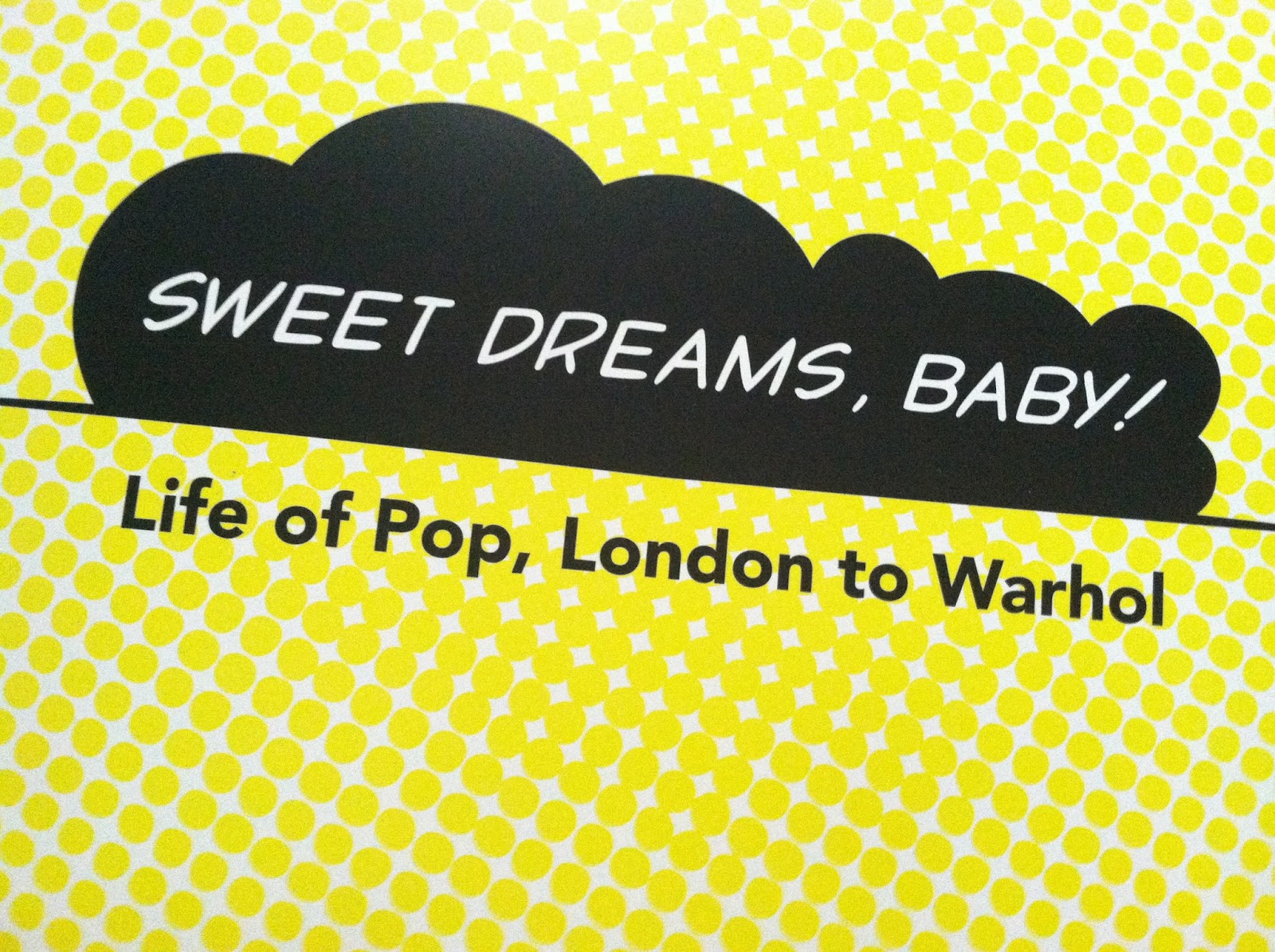
I really enjoyed the visit to the art gallery! It is funny how you drive right past something every day and never take the initiative to check it out until you are told to. I thought it was awesome that they have the "Life of Pop, London to Warhol" exhibit there for the summer so I got to see a lot of the Andy Warhol work that is in our text and from some of the videos we've seen. I really appreciated seeing the Campell's 100 Soup Cans in real life after knowing more about Warhol and his work.
A.) Which artworks make an impact or impression on me? Why?


The Tree by Agnes Martin made an impact on me because it was in the first room of paintings I was looking at and the majority of them were lines, stripes, or circles with only one or two different colors. As you can tell by this picture, there is not a lot of color in this work. I was kind of thinking, "What is going on with this piece?" as I walked closer to it. It is hard to tell but this piece was pretty much just a giant grid of squares. When I looked at the information I couldn't figure out what this had to do with a tree. I actually spent a good amount of time staring at the grid and thinking about trees. When I got home I found this quote from the artist, “When I first made a grid,” Martin said, “I happened to be thinking of the innocence of trees and then this grid came into my mind and I thought it represented innocence . . . and so I painted it and then I was satisfied. I thought, this is my vision.” Martin made fine vertical lines and lightly shaded horizontal bands in oil and pencil, softening the geometric structure, which seems to expand beyond the confines of the canvas. For Martin the grid evoked not a human measure but an ethereal one—the boundless order or transcendent reality associated with Eastern philosophies.
http://www.wikipaintings.org/en/agnes-martin/the-tree-1964


Untitled #1373 by Petah Coyne not only made an lasting impression on me but was my favorite work from the whole gallery along with, "Interior: Monet's Blue Foyer." These silk flowers were covered in wax. It was not only pretty but just so interesting. I wanted to be able touch the flowers so badly! The strings of wax reminded me of strands of hot glue from a glue gun. This work was so intriguing because I was just thinking about how long it must have taken to make and what kind of wax they used and how they melted the wax. As beautiful as I thought this piece was, I also found it to be kind of creepy because the flowers were not bright or blooming, they were wilting and the colors were so neutral. This is one of the coolest things I've ever seen!
B.) Which artworks do I feel a connection with? Why?


My favorite work from the gallery that I made a connection with was Mickalene Thomas' "Interior: Monet's Blue Foyer, 2012." This picture that I took and other pictures I found online of this work just don't cut it for this piece! You have to see it in real life to appreciate it. This painting was huge and was almost completely alone in the room it was in. It may sound silly to most but the rhinestones spoke to me! As a young girl in my early twenties, I definitely loved and related to this painting. The sparkly rhinestones, the colors, prints, and whole feel just reminded me of myself and my own apartment. It was so pretty!


The second work that I connected with was Round Trip by Helen Frankenthaler. I liked this painting because I saw it from the side at first and slowly approached it. At first when I was looking at this painting it reminded me of a road trip for some reason. The two red areas toward the top of the painting resembled aviator sunglasses to me and below looked like rivers, bridges, roads, and people. I immediately felt a sense of traveling and excitement before I looked over and read the information. I found it funny that the painting was called "Round Trip" and it reminded me of a road trip. I love to take long road trips in the car and have been across the country many times so I was connected to this painting through the idea of being on the road.
C.) Which artworks would I like to know more about? Why?


The second work I would like to know about is this collage. At the gallery there was no information next to the piece but I snapped a picture and was able to search the image in google and found out that it was part of the pop art movement so it might have been a piece that is only in the gallery temporarily with the rest of the pop art and Andy Warhol exhibit. I was excited that I was able to find it by searching with the picture though. I was able to find out that this piece was by artist, John McHale. He was a member of the Independent Group of artists from London and I believe this piece is titled "First Contact" from 1958.
Friday, June 14, 2013
Blog 4: Art Material Exploration 1: Exploring Value and The Subtractive Color Theory


2. I preferred the paint over the charcoal. Painting can be so therapeutic and it was fun to mix the colors together to create a new color.
3. The most important discovery in the creation of these studies was the idea of using cyan, magenta, and yellow rather than just blue, red, and yellow.
4. The Value Scale video explained a lot. Creating a gradient can take a lot of time and patience like the one in the video. He was very precise about everything he did from preparing the scale to sharpening and filing the pencils. Although I tried this a couple times, I was unable to produce the look of even and consistent steps as he explained in the video.
Saturday, June 8, 2013
Friday, June 7, 2013
Blog 3: Color Theory and Emotional Effects
1. Describe color and its effects on emotions. Use appropriate vocabulary of color in your posting.
There is no other visual element that provides a more pleasurable experience than color. There have been psychological studies of the effects of color and how they impact people's moods that have led to the way the world is colored around us. According to chapter 4, red is believed to increase appetite and food consumption which way restaurants often decorate in red, just as blue is said to be relaxing and calming to even lower blood pressure. The harmonies of colors and color schemes that are created using complementary colors all provide viewers with different experiences. Harmonies in combinations of lights and pigments allow color to be fluid and take the viewer's eyes to different places of the work as well as brining the work to life for the viewer.
2. What is a theoretical aspect of color that most intrigues/fascinates you?
I am most fascinated by the way light changes color because all colors are dependent on light. The way light changes the way we view colors is fascinating and as we saw in the Color Video, can be very frustrating for the artist. The woman, June, in the video kept saying "It's not the right light..." She was frustrated with the way her painting of Venice was coming along when she was creating inside her London studio. It just wasn't the same. The video also showed a moment where they were riding in a gondola along the water ways of Venice and they were talking about the way the light reflects off of the water to change the colors of their surroundings. We were then able to see them go under a bridge where you could vividly see the reflections from the sun reflect off of the water and running along the underside of the bridge. The lighting brings so much life and fluidness to the way colors run.
3. In the color video, what made the biggest impact on you in regards to color and its effects on emotions?
In the color video, the thing that made the biggest impact to me in regards of color and its effects on emotions was probably just watching June's story of creating her painting. She spoke about wanting to create a feeling of well being through the painting and really struggled with her use of colors to bring that message through. I liked the way she painted fluidly so that the painting was "kept alive." It was interesting to learn about how much lighting effects colors and even how Titian mimicked in paint the effect of light in his painting The Assumption to reflect color everywhere just as it is in real life. I believe the lighting surround the colors makes the paintings look so realistic.
4. In the feelings video, what made the biggest impact on you in regards to color and its effects on emotions?
In the feelings video, the thing that made the biggest impact to me in regards of color and its effect on emotions was that there was history behind the point in time where art actually changed to reflect feelings. It is amazing that there were always the religious paintings in churches and hung to show familiar bible stories but everything changed when the paintings grew with artistic techniques that could intensify the stories so that people could emotionally identify with them. And then the whole idea from trying to change people's minds that god is making all of the decisions to David and Goya's works expressing that hell is something we make for ourselves and we control our own actions.
There is no other visual element that provides a more pleasurable experience than color. There have been psychological studies of the effects of color and how they impact people's moods that have led to the way the world is colored around us. According to chapter 4, red is believed to increase appetite and food consumption which way restaurants often decorate in red, just as blue is said to be relaxing and calming to even lower blood pressure. The harmonies of colors and color schemes that are created using complementary colors all provide viewers with different experiences. Harmonies in combinations of lights and pigments allow color to be fluid and take the viewer's eyes to different places of the work as well as brining the work to life for the viewer.
2. What is a theoretical aspect of color that most intrigues/fascinates you?
I am most fascinated by the way light changes color because all colors are dependent on light. The way light changes the way we view colors is fascinating and as we saw in the Color Video, can be very frustrating for the artist. The woman, June, in the video kept saying "It's not the right light..." She was frustrated with the way her painting of Venice was coming along when she was creating inside her London studio. It just wasn't the same. The video also showed a moment where they were riding in a gondola along the water ways of Venice and they were talking about the way the light reflects off of the water to change the colors of their surroundings. We were then able to see them go under a bridge where you could vividly see the reflections from the sun reflect off of the water and running along the underside of the bridge. The lighting brings so much life and fluidness to the way colors run.
3. In the color video, what made the biggest impact on you in regards to color and its effects on emotions?
In the color video, the thing that made the biggest impact to me in regards of color and its effects on emotions was probably just watching June's story of creating her painting. She spoke about wanting to create a feeling of well being through the painting and really struggled with her use of colors to bring that message through. I liked the way she painted fluidly so that the painting was "kept alive." It was interesting to learn about how much lighting effects colors and even how Titian mimicked in paint the effect of light in his painting The Assumption to reflect color everywhere just as it is in real life. I believe the lighting surround the colors makes the paintings look so realistic.
4. In the feelings video, what made the biggest impact on you in regards to color and its effects on emotions?
In the feelings video, the thing that made the biggest impact to me in regards of color and its effect on emotions was that there was history behind the point in time where art actually changed to reflect feelings. It is amazing that there were always the religious paintings in churches and hung to show familiar bible stories but everything changed when the paintings grew with artistic techniques that could intensify the stories so that people could emotionally identify with them. And then the whole idea from trying to change people's minds that god is making all of the decisions to David and Goya's works expressing that hell is something we make for ourselves and we control our own actions.
Subscribe to:
Posts (Atom)